I get emails all the time on my paint color in the main areas of my house, and after this post from yesterday i got a few more. I actually repainted a few months back and forgot to post any before & after pics.
Honestly, the change was so subtle no one really even notices! Except me of course :)
Here are a few pics from the past with the old color…Whoah! These are some old pics! Almost nothing is the same as it is now!!
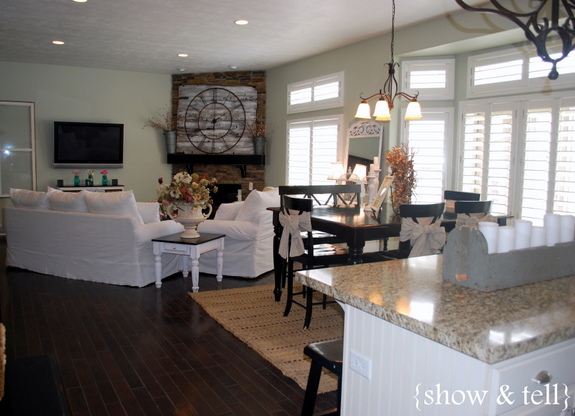
I really liked the color, it was a greenish gray and very neutral. It was one that kinda changed with the day. Sometimes though the green was a little too much and it clashed with some other colors that i tried to bring in. Sometimes i thought it was a little too “minty” – like toothpaste :)
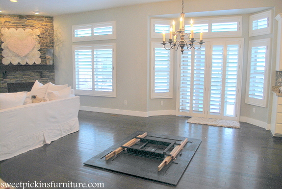
Here is one a little more recently…
So a couple months back i decided to paint. I still wanted to keep the light and bright, but get rid of the green tone. I painted over all the green with Sherwin Williams Repose Gray tinted @ 125% in a satin finish. I really like the color, its clean and fresh and is dark enough that it contrasts with all the white shutters and molding. Plus its a warm gray and looks great with our dark hardwood floors.
This pic is a pretty accurate look @ the new color…
What do you think, can you even tell the difference?!!
I love the heart above the fireplace. did you make that?
sure did! You can find the post here…
https://www.milkpaint.com/2013/01/vintage-inspired-valentine-sign.html
I LOVE this color. It looks great with everything you have. It is a beautiful color and it makes all of the other colors in your room even prettier – an awesome neutral. I am thinking of doing my living room this color this spring. We have a stone fireplace too, I love how the color looks with yours. I have a crush on your white couches ;)
Amy C.
it really is a perfect gray :) And i love my white couches too!
I love this color way more then the old one. It looks amazing with your shabby style! Enjoy!
thank you and me too!!
I love it. Good choice. You can’t go wrong with a good grey.
love your center coffee table!!! I assume you made it? I sent you an email needing your logo, did you see it? Hope it isn’t in junk box!
I love it – it looks fresh! I also love your new chandelier in your kitchen! Where did you get it?
both the kitchen one above the island and the one over the kitchen table are both 2nd hand finds :)
Just beautiful. I recently repainted my red kitchen/dining room a darker gray than yours and I really love the new look. Dramatic change. Come on over and see. Plus I have a giveaway.
Sausha, I absolutely LOVE following your blog!! Small world, but I am about to paint the exterior of my house repose gray! What does it mean that it is tinted @ 125% satin finish?
thank you!! I just wanted the paint a little darker, but not dark enough to go up to the next color, so by tinting it 125% it just makes its slightly darker. Any paint store will do that for you and you can go up or down making it lighter or darker :)
I love the mountain haze! after finding your blog, i had my house (other than beds and baths) painted that color, and I still LOVE it! So bright and clean. But I do agree, on some days, especially in my kitchen, it does look quite minty, even seafoam-ee. Which I dont love, but overall I think its a great color and goes with a lot. Thanks for heloing me make my house cuter! PS, you should be a handy-girl! I would love to do all the trims and moldings you do, if only I knew how to use saws! You should hire yourself out for projects :)
it is a really good color – i just needed a change :) And im sure you can totally use a saw! Once you try it you will wonder what you were ever scared of! :)
I just stumbled upon your blog tonight from someone pinning your “EAT” letters in your kitchen. I have been perusing… and really enjoying your blog. I had to chuckle when I read in a past post, I think it was your home tour, that you were into the green, golds and brown. That is what is in my house now. I feel kind of stuck with it. I love the airy feel of your main level. Yes, definitely can tell the difference. It is a beautiful shade of gray. I liked the old color too, but see what you mean. It did have that kind of minty look, didn’t it. :) Pretty color though. :)
it was a good color, but the gray is much better for me now :)
Hi,
Definitely can tell a difference and I really like this color. What color did you paint the trim and ceiling?